Inspection Method Report
Cognitive Walkthrough Report for GrubHub
Table of Contents
1. Why we choose CW as our inspection method?
- Cognitive Walkthrough method is quick, easy to set in place, and convenient to conduct.
- Although Cognitive Walkthrough method seems light, it provides full and useful guidance for us to evaluate a product. Four questions are organized and fulfills the important parts of the product, especially since it provides a clear sequence of events.
- Heuristic Evaluation Method provide ten standards to analysis each steps of a product, which means the results would be too detailed. And sometimes, you couldn’t answer some questions since they’re not obvious to find.
- Heuristic Evaluation Method focuses more on the interface design problems, like “Visibility of system status”, “Match between system and the real world”, “Flexibility and efficiency of use” and “Aesthetic and minimalist design”. However, for our research product GrubHub we want to discuss more about the feature performances and the logic behind each step.
- The question that we are asking is relevant to the inspection and can be helpful to improve the product (from a developer point of view).
2. Cognitive Walkthrough
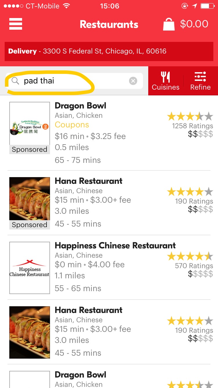
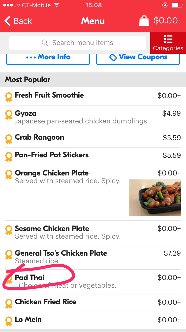
Task:Search for Pad Thai in nearest restaurant by distance, lowest price ($), and 3-star rating & up. Users:Not a frequent user of GrubHub, but have use the app at least once. Questions:
- Q1: Does the next action makes sense to the user?
- Q2: Is the action visible?
- Q3: Will the user recognize the action as the one they need?
- Q4: Will the user understand the feedback?
Cognitive Walkthrough Table
| # | Steps | Q1 | Q2 | Q3 | Q4 | Notes |
|---|---|---|---|---|---|---|
| 1 | Input Pad Thai in search the bar. | Yes The search bar is visible to the user. | Yes The keyboard becomes visible to the user when they tap in the search bar. | Yes The search bar has text within it, indicating this as the right location to input a query. | Yes The results list restaurants that offer Pad Thai. | I will say that if the user were to expect the results to show a comparative list of Pad Thai dishes, then they would get confused. Instead, the user is given a list of restaurants that offer the dish. |
| # | Steps | Q1 | Q2 | Q3 | Q4 | Notes |
|---|---|---|---|---|---|---|
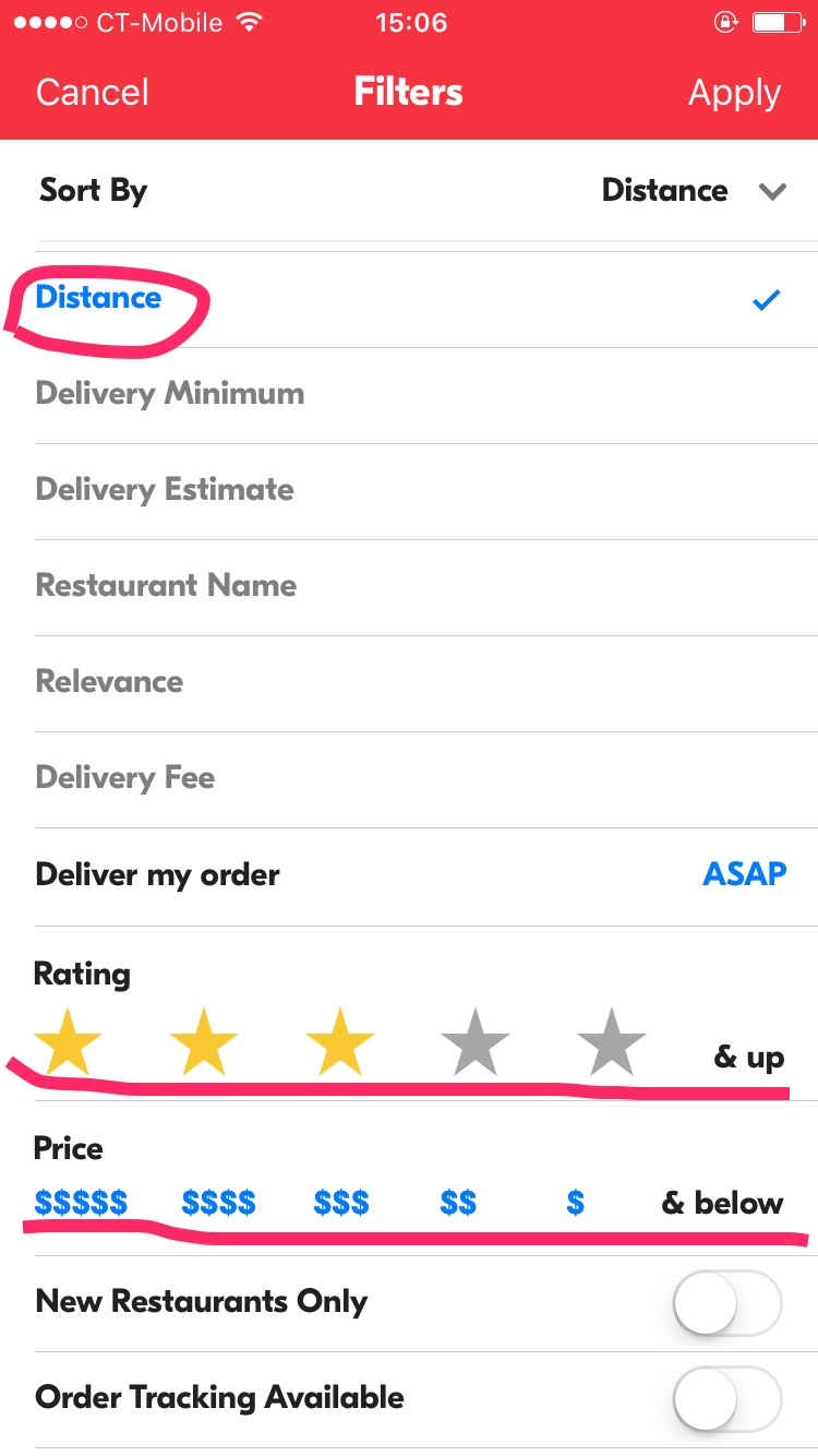
| 2 | Use the filter/refine button to 1.Sort By: Distance 2.Ratings: ★★★ & up 3.Price: $ & below | Yes After users set their filters, and choose “Apply”, the filtered restaurants will showed in the homepage. | Yes Although “Sort By” and “Deliver my order” need users to choose in a hidden stage, all the filters choices are clearly visible. | Yes The choices in Filters have strong introductions for users to easily understand. And users could choose any one if they need. | Yes The chosen result in “Sort By”, “Deliver my order” and “Price” will become blue;The asteroid figure would become yellow after users choose;The last three filters provide on-off button for users to choose, and once users tap, the button will become switch to blue. |
| # | Steps | Q1 | Q2 | Q3 | Q4 | Notes |
|---|---|---|---|---|---|---|
| 3 | Choose the nearest restaurant | No Even though results have already sorted by distance you have to assume the first result will be the closest, whereas there is no other visual indicator acknowledging it to be the correct choice. Not very clear, and greyed out. | No The mileage is shown in the description that follows the restaurant, but you have to compare at least one other to know that it is the shortest route | No The results have been sorted in ascending by distance, as well as, but the user will have to verify by comparing | Yes Mileage is sorted in ascending order, as well as there is a visual indicator of range. Assuming the user is confident of their selection | The only concern I could in this step is that there is no certain selection, as in GrubHub does not say for certain the first selection is the nearest, you are to assume or compare on your own accord, and trust that the app is functioning correctly |

| # | Steps | Q1 | Q2 | Q3 | Q4 | Notes |
|---|---|---|---|---|---|---|
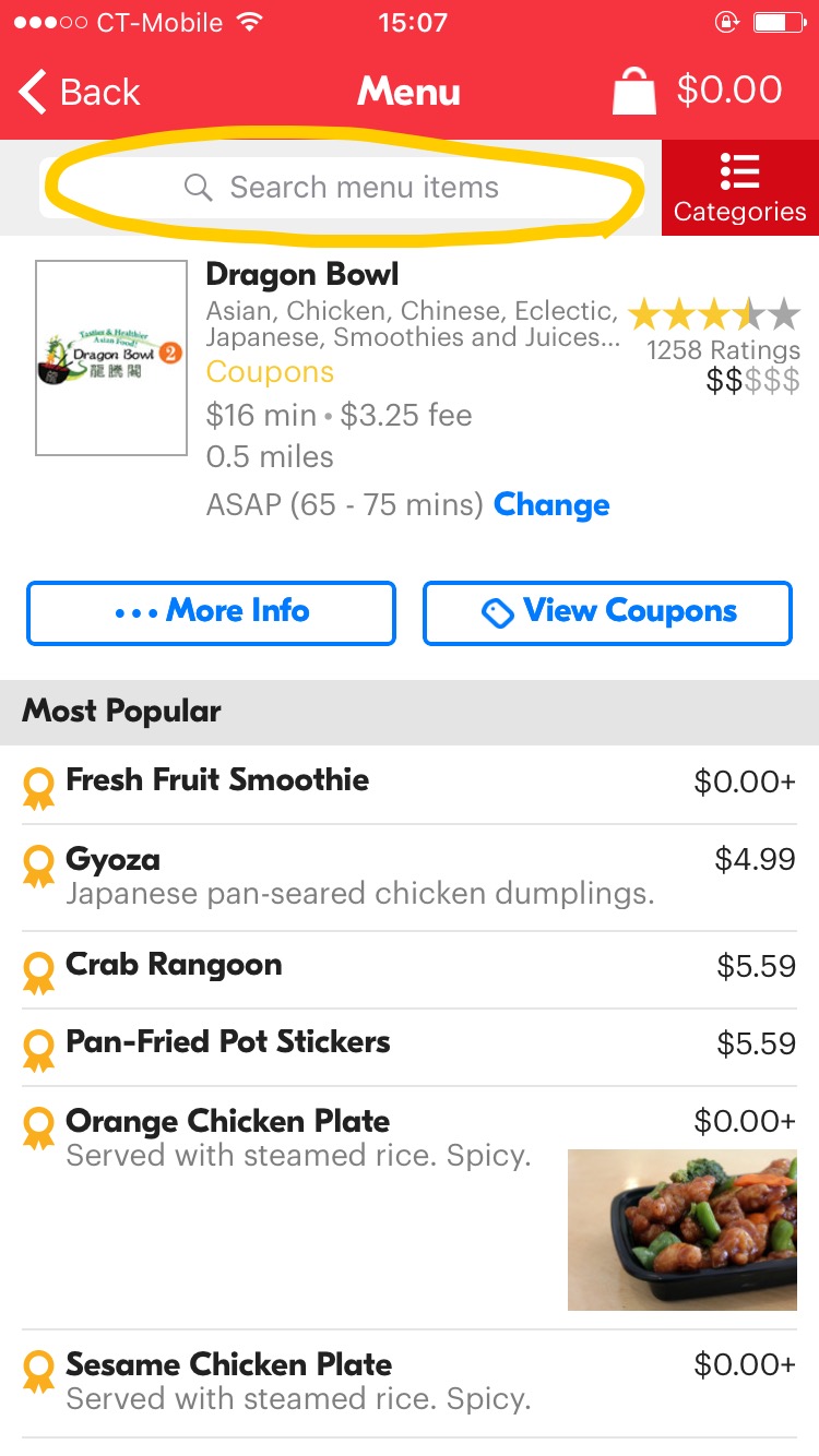
| 4 | Select the Pad Thai dish - Scroll down the menu to find Pad Thai | Yes The results are displayed as a list and it makes sense to ask the user to scroll it to see more options | Yes Same as Q1, all the results are displayed. In addition, a small scrolling bar is visible on the right side of the screen (indicates that there is more to see below) | Yes If they don’t see a choice that fits what they are looking for, they will definitely scroll the screen | Yes When scrolling the screen the results are moving like expected. In addition, the scroll bar is moving giving feedback on how many results are left in the list | Nothing to add or change to this step. The action is pretty standard, understandable for an unfamiliar user, and the feedback is clear and redundant. |
| # | Steps | Q1 | Q2 | Q3 | Q4 | Notes |
|---|---|---|---|---|---|---|
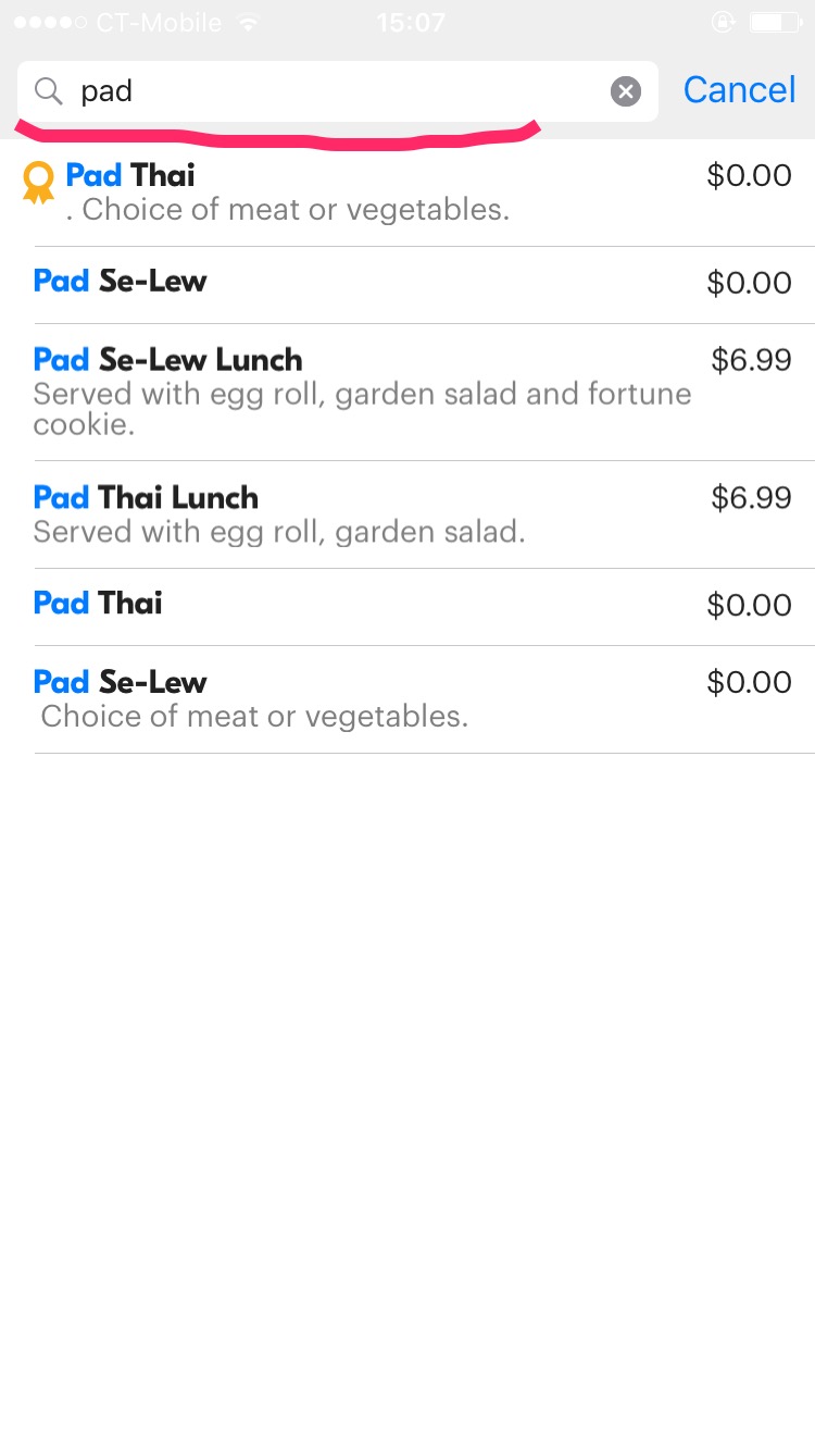
| 5 | Select the Pad Thai dish - Input pad thai into search bar | Yes Users can input Pad Thai in search bar and a list of the results is shown, and users can choose anyone they want. | Yes The search bar is obviously visible on the page. | Yes The blank search bar with grey details “Search menu items” tells users to input dishes they want. | Yes If the user inputs the correct dish name, they will see the results in the list. |
3. Takeaways
- To standard actions such as using the search bar, as well as scrolling through results, are easy to understand by the user, but are not 100% always apparent or clear in its results
- We cannot always assume the user is always coherent with their ability to choose the correct selection, instead the application should do it’s fair share to guide them without being too overwhelming or bothersome
- Although the filters are not completely necessary, it helps the user break down selection bias by adding specifics in terms of price, reviews, and distance
- After running this test, the conclusion is that GrubHub did a pretty good job to make is search process as comprehensible as possible; almost every step did pass the cognitive walkthrough