Competitive Analysis Report
To realize this competitive analysis report we decided to focus on the “search process” of GrubHub. For the competition, we choose both Eat24 and UberEATS as GrubHub’s direct competitors, and Groupon as indirect competitor. We compared the features around the “search process” of these different products and here are the results below.
Table of Contents
1. List of competitors
GrubHub has two types of competitors: direct competitors which provide the same service (ie. food delivery) and indirect competitors which can be a substitute of the service proposed by GrubHub (eg. different markets, value proposition).
- Direct Competitors
- UberEATS
- Amazon restaurant
- Delivery
- Yelp Eat24
- Caviar
- Groupon To Go
- Foodler
- Indirect Competitors
- BlueApron
- HelloFresh
- Peapod
- Freshii
- Food trucks
- Direct order from specific restaurant
- Instacard
- Direct eating to a restaurant
- Amazon Pantry
- Yelp
- Groupon
- HappyCow
- OpenTable
- Google, Yahoo, etc. (search engines)
- DiningIn
- Word of mouth
2. Flow chart
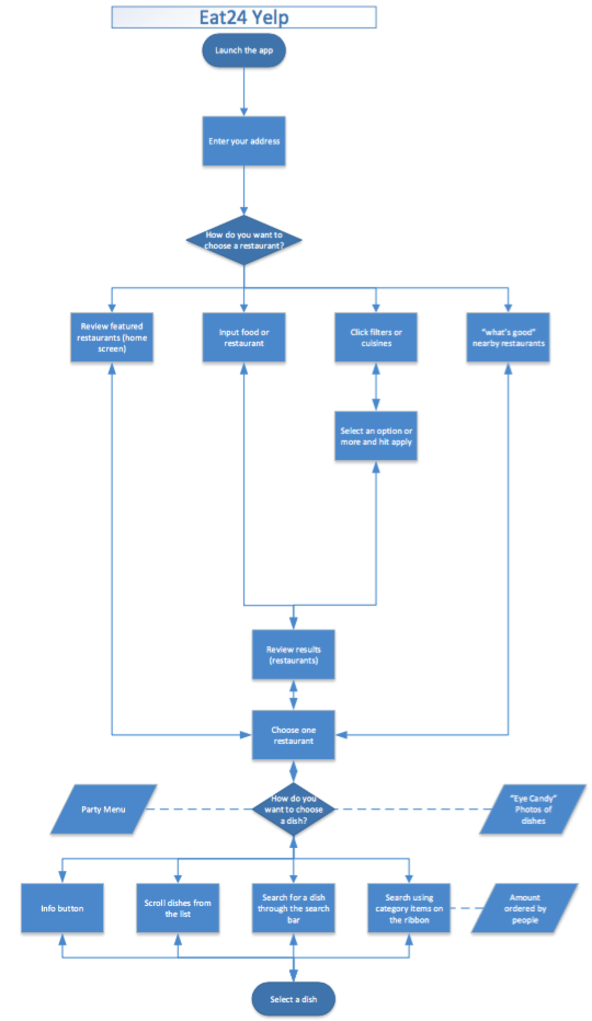
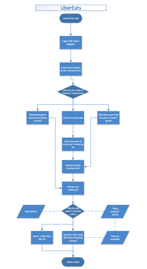
The so called “search process” starts with the “launch the app” task and ends when the user is able to “select a dish”. 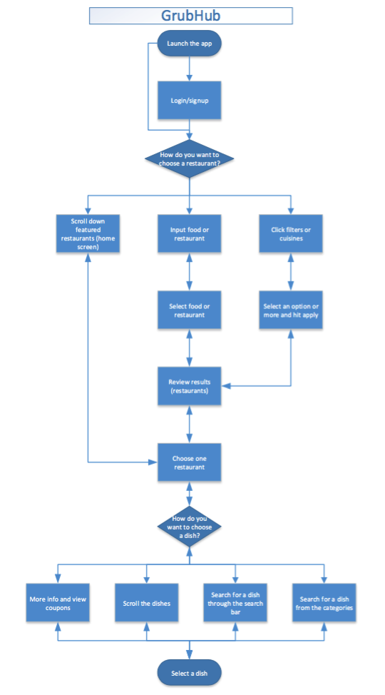
3. Competitor Analysis Table

4. Takeaways
From the flow charts and the competitors table above, we can find that most features of the “search process” in the direct competition are similar in comparison to Eat24 and UberEATS, even though the title of features may be different. However, there are still some particular differences we need to analyze and determine whether or not they are beneficial to aid our future design.
Difference:
Login in UberEATS Only UberEATS asks the users to first login (using uber accounts). We believe this feature is specific to UberEATS because the application relies highly on Uber to deliver the food. We will not apply this aspect in GrubHub since we want to give our current and future users full reign to browse the application. Qi for instance, downloaded GrubHub last year, but just used it for the first time two months ago; she liked to browse the restaurants and menus even though she did not create an account, nor was set on ordering anything for that moment.
Add address in Eat24 Users in Eat24 have to input the zip code or choose the default location every time they launch the app (image 4.1), we think this step could be dismissed and just let the current location be present on the homepage just like GrubHub and UberEATS (Although, users have to type in the location the first time, the place will be cached by the system and show thereafter. Users can also choose the current location by GPS which is much more flexible as well.)

(image 4.1) More categories: Four flavor options in Eat24 and “Most Popular Dishes” in UberEATS Eat24 and UberEATS provide more options for restaurants and food categories, especially the UI is attractive (image 4.2 and image 4.3). However, we do not think adding more categories is the primary focus since GrubHub already has a lot of options in its “Filter” feature. At the current time we do not think they are very important, and do not have the data source to prove that “more categories” is a key feature to attract new users. According to the user tests and personas designed before, we did not feel like users were requesting this feature in particular.
(image 4.2) 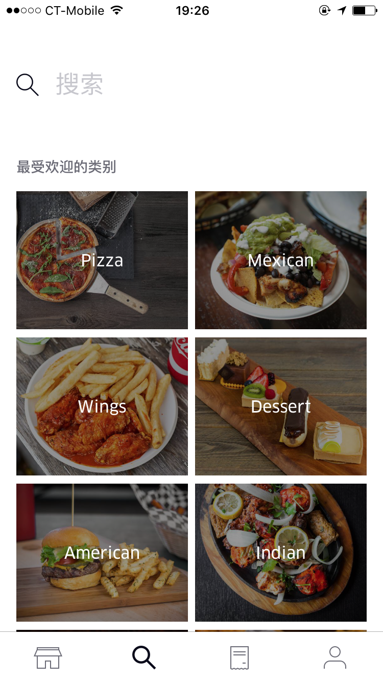
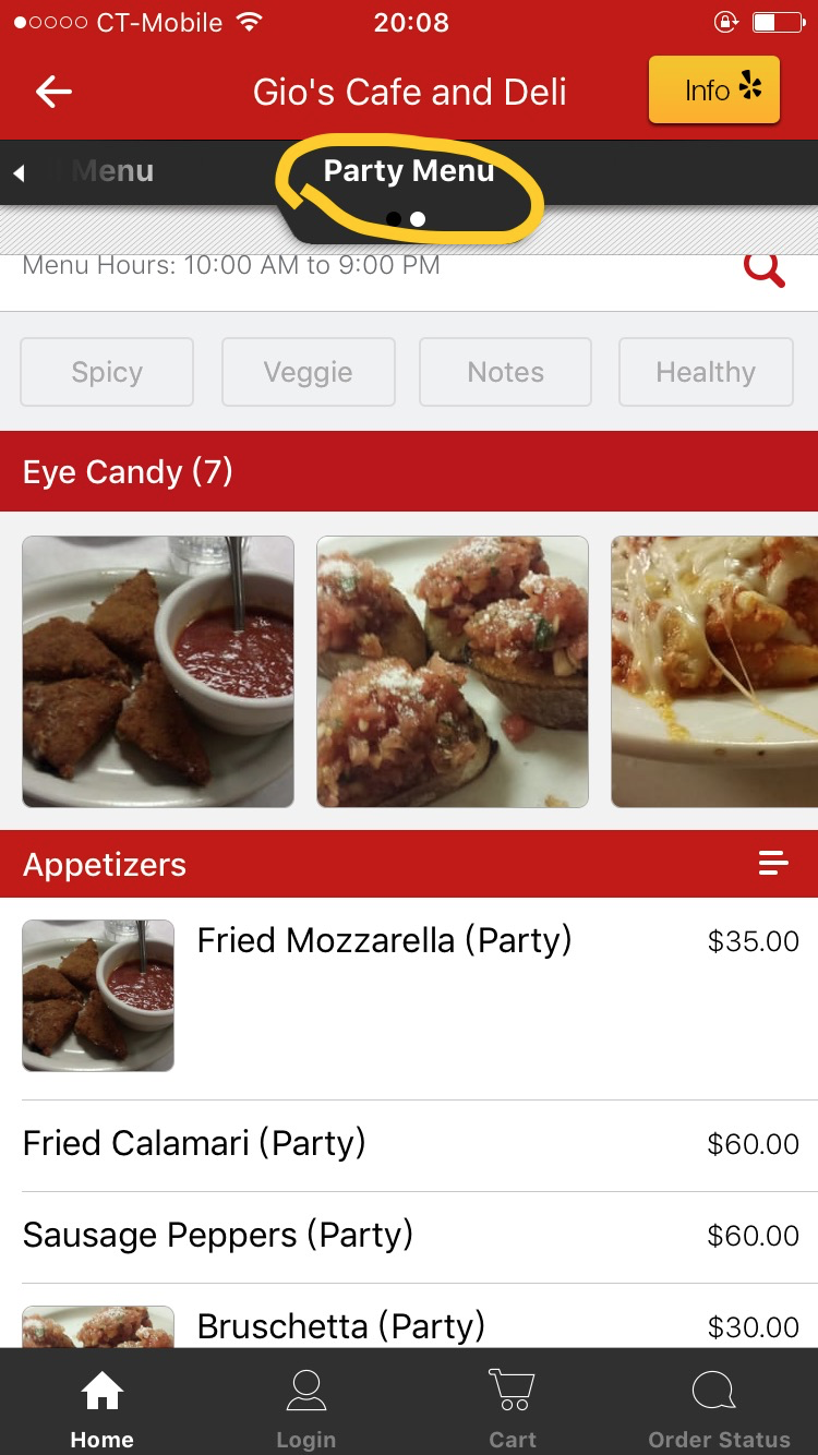
(image 4.3) Party Menu in Eat24 Both Eat24 and UberEATS have the “Party Menu” for people who want to quickly order food for a party. This feature is tricky due to the fact that the party is a crucial scenario for food delivery application. “Party Menu” recommends food suitable for big groups of people, helping them to make decisions more quickly. GrubHub can replicate this feature, but is not limited to “Party menu”. According to the user tests and personas realized before, we can add a similar menu like “Working Lunch Menu” for people in the office needing food in a more urgent manner.
(image 4.4) 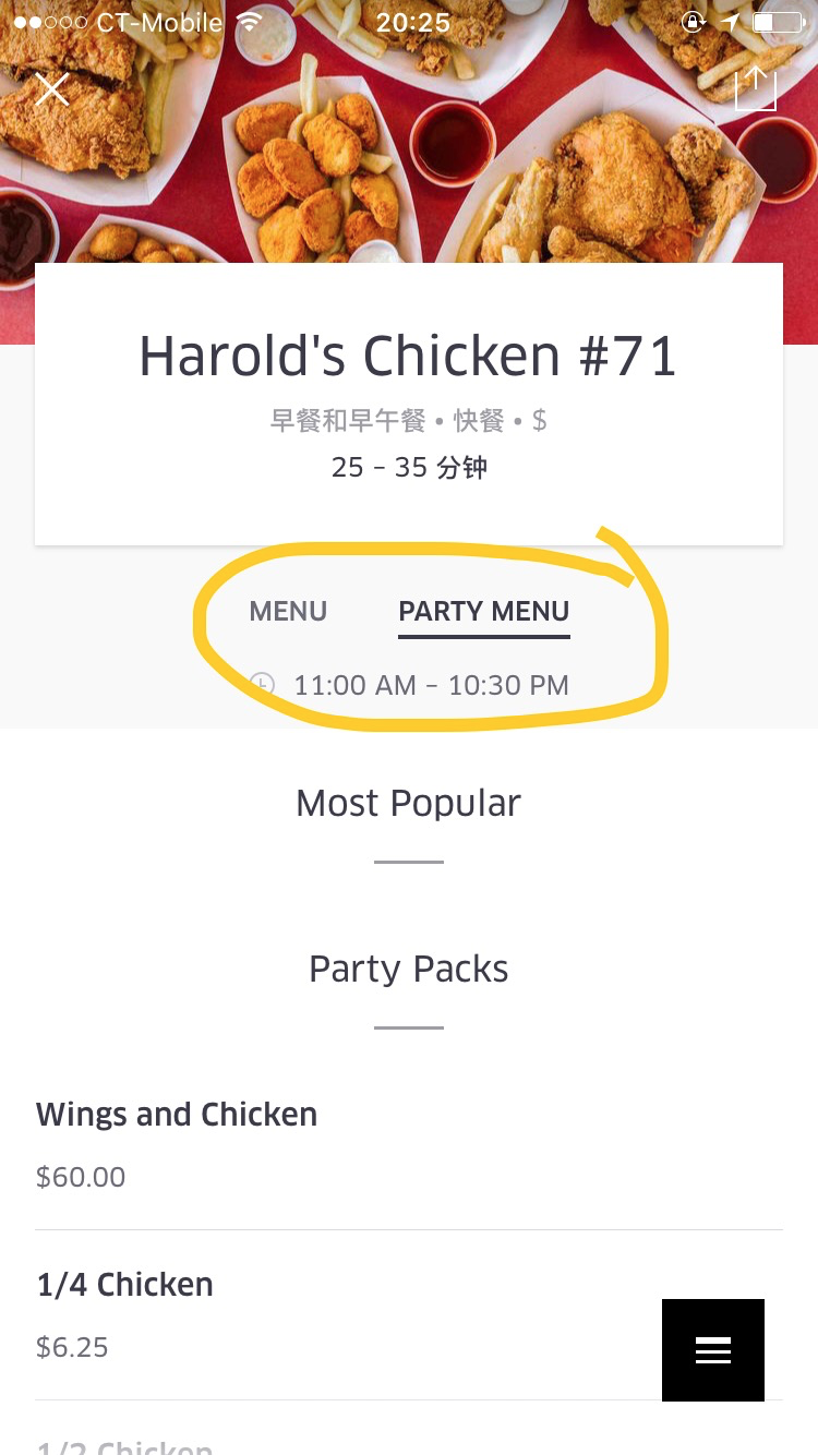
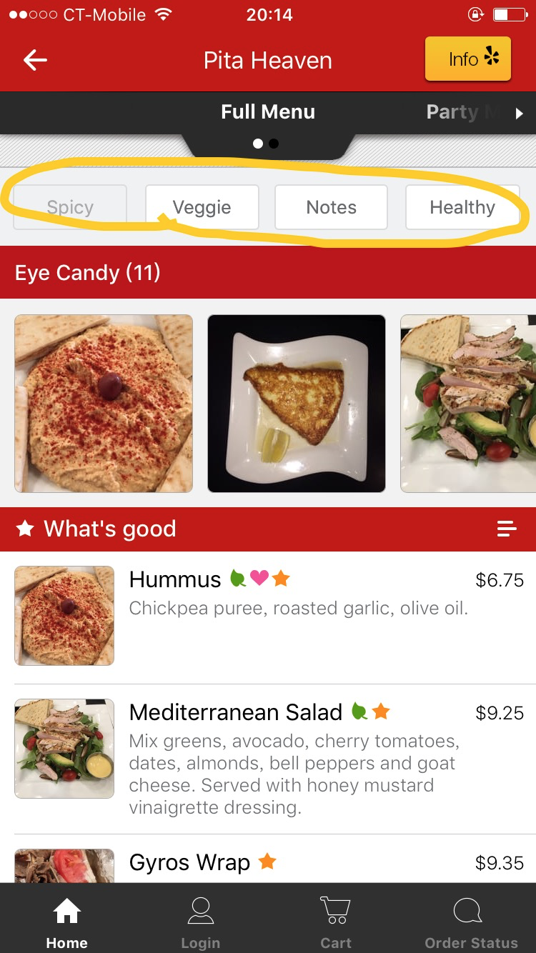
(image 4.5) What’s Good, Eye Candy, and View Informations in Eat24 These three features (images 4.6, 4.7, 4.8) in Eat24 have one similar resource: real pictures uploaded by users. Eat24 chooses real attractive pictures, high rate reviews, and transforms them as “What’s Good” (when you’re choosing a restaurant) and “Eye Candy” (when you’re choosing dishes). It is much more convenient for Eat24 since users can browse the reviews from Yelp here. Most users like full descriptions of foods, especially real pictures, which can help them make decisions as to figuring out what the food looks like and whether it is attractive.
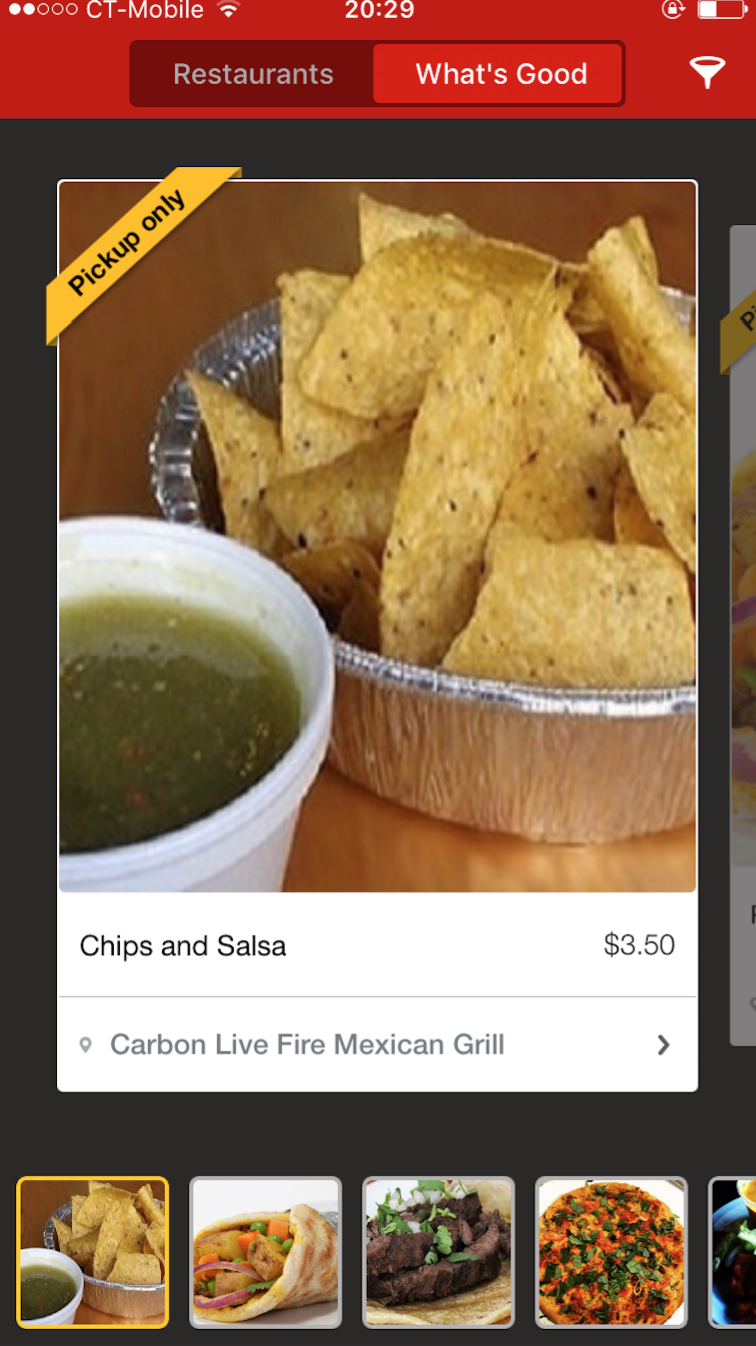
(image 4.6) 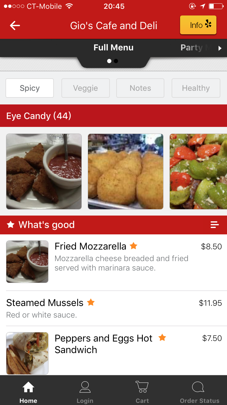
(image 4.7) 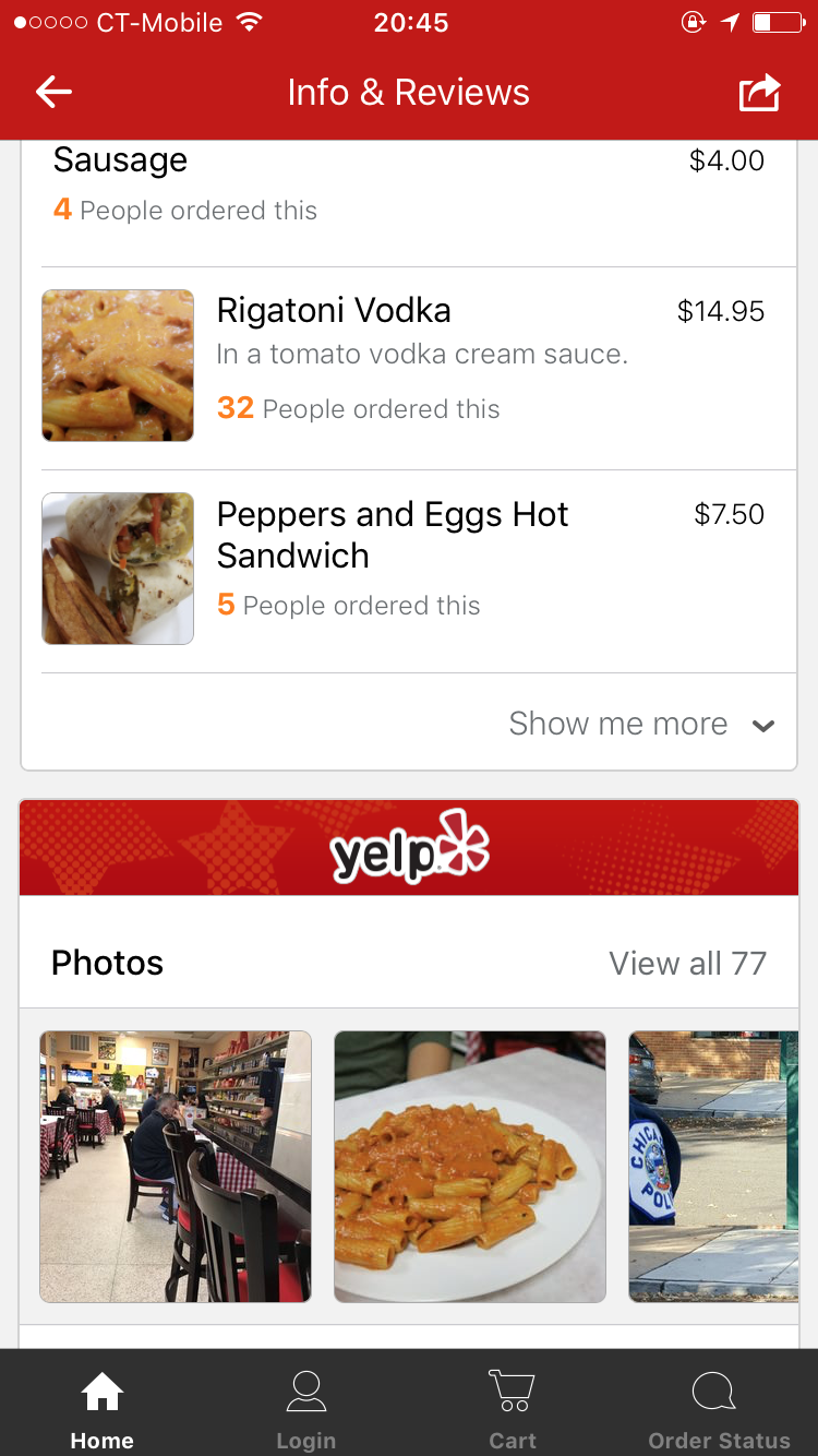
(image 4.8)
5. Summary
- Competitors have slightly different features for providing the “search process” but it’s not significant enough to create a change
- UX does not drastically change from app to other app
- The process we studied is really similar between competitors
- The difference we picked up on are interesting, but not critical from a retention point of view
- Competitive analysis did not tell us a lot about the advantages or disadvantages GrubHub has compared to its competition
- Basically, every application we studied offer the same experience without any presenting real innovation
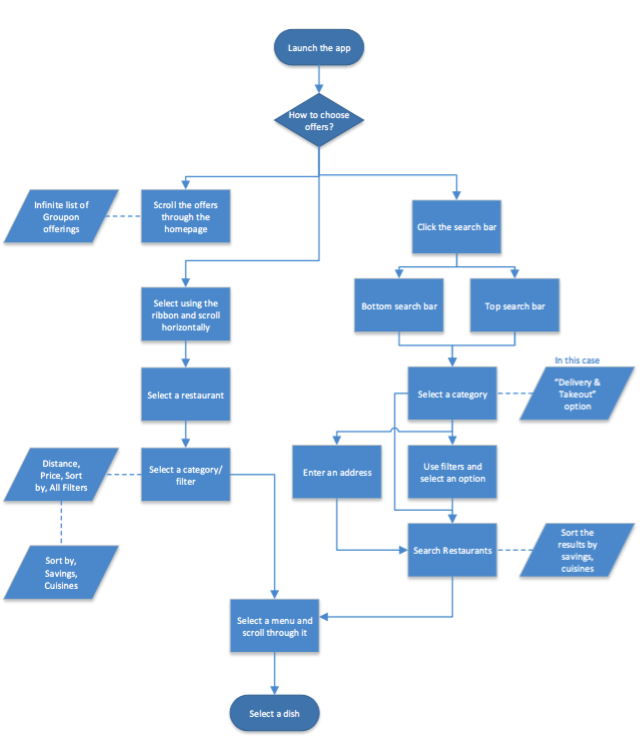
- Groupon, however, was a bit different from the rest, as this is an indirect competitor
6. New ideas for GrubHub
Based on what we saw, here is a short list of improvements or new features that could enhance the user experience when using GrubHub’s application:
- Users can update the real pictures in the reviews and earn coupons.
- Update pictures → earn points → redeem points for coupons and discounts
- Add special menu like “Working Lunch Menu” based on user reviews.
- Example: “quick eats” or quick delivery, happy hour, or late night
- Maybe asked the user, when launching the app, the reason why he or she is ordering food. Based on the answer, one idea could be to suggest restaurants/dishes that people chose in the same situation
- Geolocation caching, whereas the user will be suggested restaurants that local people from within the business or surrounding is ordering from constantly
- Provide additional photos of menu items